Dashboard performance is a product problem
Improve dashboard performance through useful paint, data readiness, stable loading states, efficient queries, caching, and honest freshness.
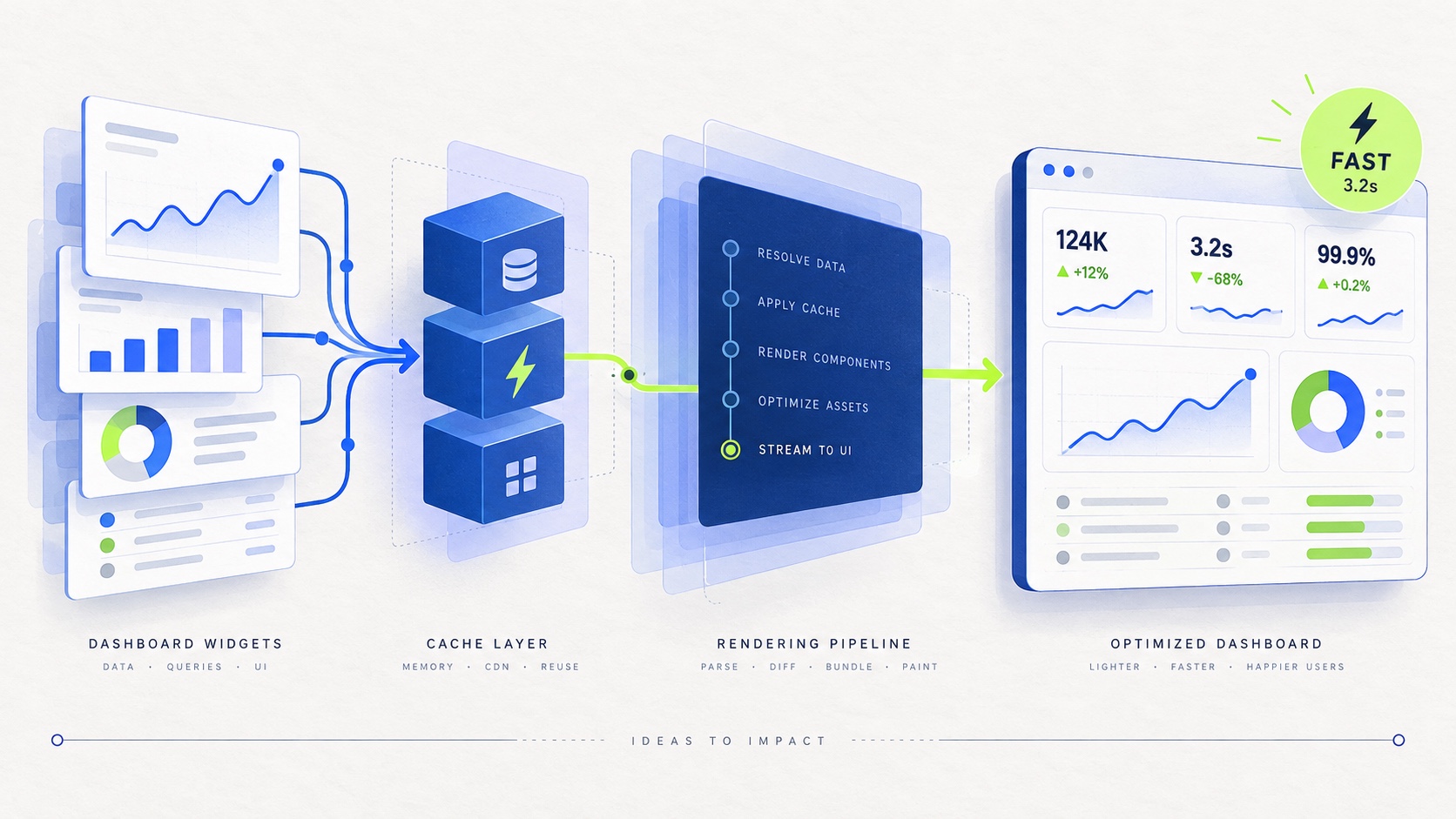
A dashboard is not fast because one request returns quickly.
It is fast when a person can open it, understand what they are looking at, change the scope, and trust the result without waiting in confusion. That is a wider standard than a single latency number. It includes rendering, data readiness, interaction feedback, cache behavior, and the product’s honesty about what has or has not updated.
This distinction matters because dashboards are where several systems meet. A page may depend on a browser render, an API request, an analytical query, a cache, a background ingestion pipeline, and a user’s interpretation of the result. Each layer can be individually healthy while the experience still feels slow or unreliable.
The useful question is not “How fast is the dashboard?” It is:
What can a person confidently do at each moment of the experience?
There are several clocks, not one
Before changing code, I name the moments that matter. A typical dashboard has at least four clocks:
- First useful paint: when the page provides enough structure for someone to orient themselves.
- Data readiness: when the primary numbers are complete for the selected scope.
- Interaction response: when a filter, tab, or drill-down acknowledges an action.
- Freshness: when a recent change is reflected in the report.
These clocks can move independently. A page can render its shell immediately while the primary metric remains blank. A filter can animate instantly while the request behind it is still using an old value. A save can succeed while the reporting pipeline has not processed the new event yet.
Collapsing all of that into “the dashboard loaded in two seconds” hides the part people actually experience. A good performance investigation starts by deciding which clock is failing.
Start with the question, not the component
Performance work often starts in the wrong place. Someone sees a slow table and asks whether the table component should be memoized. Someone sees a delayed chart and asks whether the chart library should be replaced. Those questions may eventually matter, but they are not the first questions.
The first questions are about the job the page is helping someone do:
- What is the first decision the page should support?
- Which number or state is essential for that decision?
- What can arrive later without blocking the decision?
- Which filters change the meaning of the result?
- How stale can the answer be before it becomes misleading?
This gives the page a priority order. A headline metric, its time range, and a clear loading state may be more valuable than rendering every secondary breakdown at once. A table with the first useful rows may be better than a blank page waiting for the complete result.
Performance is partly a question of resource allocation. The interface should spend its earliest milliseconds on the information that reduces uncertainty first.
Make the loading state truthful
A loading state is not just a visual transition. It is a promise about what the product knows.
There are at least three different situations that are often represented by the same spinner:
- The request has not started.
- The request is running and no answer is available yet.
- The previous answer is still visible while a new scope is being calculated.
These states have different implications for trust. Replacing a useful previous result with a blank skeleton on every filter change makes the interface feel slower and removes context. Keeping the old result visible forever, however, can make people mistake stale data for current data.
The right choice depends on the action. For a small scope change, I usually prefer stable content with a visible pending treatment: keep the layout in place, acknowledge the new selection, and make it clear that the values are refreshing. For a first load, a structured skeleton can help the person understand the shape of the page before the data arrives. For an error, the interface should preserve the last known answer only if it labels that answer as stale.
The important distinction is between not ready, empty, stale, and failed. They are different product states, not four styles of loading indicator.
Protect layout stability
Even a short wait feels longer when the page moves under the reader’s eyes. A chart that changes height when its legend arrives, a table whose columns resize after the first response, or a filter bar that shifts when a control becomes available all add cognitive cost.
Stable layout is a performance feature because it lets someone begin reading before every detail has loaded.
Some practical rules help:
- Reserve space for the main metric and chart before data arrives.
- Keep table headers and column widths stable while rows stream in.
- Use consistent empty and error containers so the page does not collapse.
- Avoid changing the position of primary controls when secondary data appears.
- Treat skeletons as layout contracts, not decorative approximations.
The goal is not to freeze every pixel. It is to make changes intentional. When content updates, the reader should be able to understand what changed and why.
Reduce the work before optimizing the work
When a dashboard is slow, the most valuable optimization is often removing work.
That can mean narrowing the default time range, avoiding a query for a panel below the fold, combining requests that always share the same scope, or not calculating a breakdown until the user asks for it. It can also mean changing the shape of the API so the browser receives the information in the order the interface needs it.
This is where frontend and backend design meet. A backend that returns every possible dimension may be flexible, but it forces the first interaction to pay for data that most users will never inspect. A frontend that requests each small card independently may be easy to compose, but it can create a waterfall of avoidable round trips.
I look for three kinds of waste:
- Unused data: fields or panels that are fetched but not needed for the current view.
- Repeated work: identical queries or transformations performed for multiple consumers.
- Misplaced work: expensive computation performed in the browser when it belongs closer to the data, or performed on every request when it could be reused safely.
The answer is not always to move computation to the server. The answer is to make the boundary explicit and choose the cheapest place that still preserves correctness.
Design filters as part of the performance model
Filters are often treated as controls, but they are also query-shaping decisions. A date range, tenant, source, attribution model, or consent mode changes what the backend must calculate and what the result means.
A filter experience becomes slow and confusing when the UI treats these values as an unstructured bag of state. The request can start before all constraints have settled, the URL can describe a different scope than the query, or a cached response can be reused for an answer it does not actually represent.
I prefer to model the report scope explicitly. The client should know which values are required, which values are optional, and which combinations are invalid. The API should validate the same boundary rather than assuming the browser got it right. Cache keys should include every input that changes the answer.
type ReportScope = {
  from: string
  to: string
  sourceId: string
  attributionModel: "first_touch" | "last_touch"
}

const scopeKey = (scope: ReportScope) =>
  [scope.sourceId, scope.from, scope.to, scope.attributionModel].join(":")
The useful detail is not the helper itself. It is that the inputs which change the answer are named in one place, making an incomplete cache key easier to spot during review.
This is both a correctness practice and a performance practice. A well-defined scope reduces accidental queries, makes cache behavior predictable, and prevents the interface from showing a fast answer to the wrong question.
Freshness is part of speed
People do not only wait for a dashboard to render. They wait for it to become current.
That is especially visible in products where a user has just changed a setting, received a conversion, or triggered an event and expects the report to reflect it. A page that renders instantly but displays yesterday’s state without explanation can feel slower than a page that takes longer and communicates its freshness honestly.
Freshness needs a contract. The product should know whether data is:
- available immediately from the request path;
- delayed by an ingestion or aggregation pipeline;
- served from a cache with a defined lifetime; or
- unavailable because the source has not reported successfully.
Once that contract exists, the interface can show useful language: last updated time, pending processing, stale data, or a refresh action. Without it, teams often hide the problem behind a loading animation that cannot make new data appear.
Measure the experience users actually have
Synthetic request timing is valuable, but it is not enough. I want measurements that map to the four clocks:
- time to first useful structure;
- time until the primary metric is ready;
- time from interaction to acknowledgement;
- time from an upstream change to visible freshness.
I also want to separate successful fast experiences from misleading fast experiences. A response that returns quickly with an error, an empty result, or an old scope is not a successful performance outcome.
That means performance telemetry should include the report scope, the request state, whether the result came from cache, and the freshness of the underlying data. These fields make it possible to compare like with like instead of averaging together unrelated screens.
The practical definition of fast
For a dashboard, fast means that the system spends waiting time deliberately.
The first screen helps a person orient themselves. The primary answer arrives before uncertainty becomes frustration. Interactions acknowledge intent immediately and keep the layout stable. Expensive detail loads when it is relevant. Freshness is visible instead of implied. Errors preserve as much useful context as possible without pretending the answer is current.
None of this requires every query to be instant. It requires the interface, API, and data pipeline to agree about what the person is waiting for.
The best performance work therefore looks less like a collection of micro-optimizations and more like product design. Decide what matters first, make the data contract explicit, remove unnecessary work, and tell the truth about every remaining wait. That is how a dashboard becomes not merely quick, but usable and trustworthy.